chromeでブラウザ幅を変更した際、幅によって背景画像が見切れたり見切れなかったりする現象に遭遇したので、その際の対応方法をメモ。
サンプルコード
例として、リンクの背景にアイコン画像を設定してみます。
<ul class="l-nav">
  <li class="l-nav__item"><a href="/mypage/">マイページ</a></li>
</ul>
コンテンツ右端にリンクを寄せて、リンクテキストの右側に背景画像が表示されるように設定します。
.l-nav {
  display: flex;
  justify-content: flex-end;
  max-width: 1100px;
  margin: auto;
  padding-top: 30px;
}

.l-nav__item a {
  display: inline-block;
  padding-right: 25px;
  color: #6a8eae;
  font-size: 16px;
  font-weight: bold;
  text-decoration: none;
  background: url(icon.png) right center no-repeat;
}
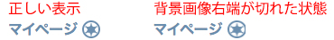
デモページをブラウザ幅変更しながら確認するとわかると思いますが、ブラウザ幅によって背景画像の右端が切れたり切れなかったりしています。
chromeで背景が切れる場合のデモページ
対応方法ですが、背景画像の配置指定を「right」としていたのを、「right 0px」とすることで発生しなくなりました。
.l-nav {
  display: flex;
  justify-content: flex-end;
  max-width: 1100px;
  margin: auto;
  padding-top: 30px;
}

.l-nav__item a {
  display: inline-block;
  padding-right: 25px;
  color: #6a8eae;
  font-size: 16px;
  font-weight: bold;
  text-decoration: none;
  background: url(icon.png) right 0px center no-repeat;
}
コメントが承認されるまで時間がかかります。