UIコンポーネント集を構築できるツールのStorybookを簡単に使ってみます。
今回はStorybook for HTMLを使用します。
インストール
プロジェクトディレクトリに移動して、下記コマンドを実行します。
npx storybook init --type html
package.jsonや各種パッケージ、サンプルファイルなど、Storybookに必要なファイルが追加されました。
インストール完了後、下記コマンドを実行します。
npm run storybook
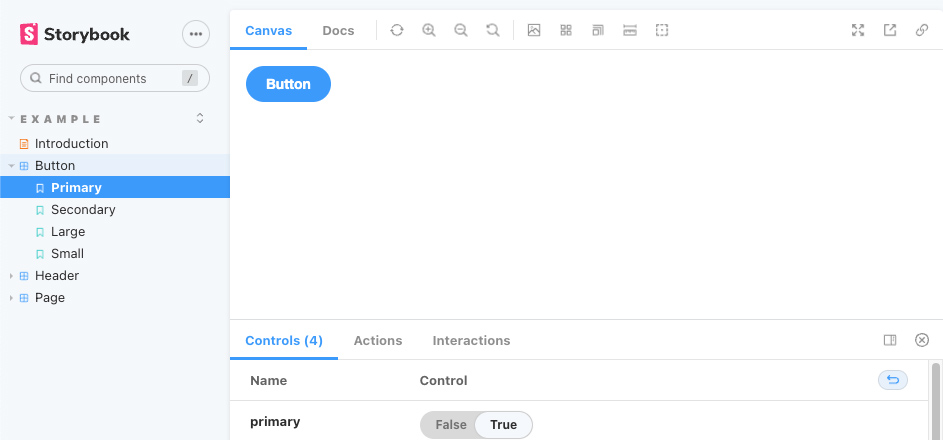
ローカルサーバを起動され、ブラウザで表示を確認できました。

左ナビのButtonをクリックすると、サンプルで用意されているボタンのコンポーネントを確認できます。
コンポーネントの追加
コンポーネントを作成するには、storiesディレクトリ内に.stories.*の拡張子でファイルを追加します。
この設定は.storybook/main.jsから変更できます。
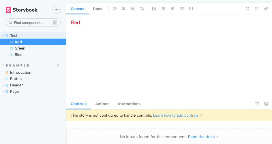
例として、Test.stories.jsを追加してみます。
import green from './test-green.html';
import './test.css';

export default {
  title: 'Test',
};

export const Red = () => '<div class="test-red">Red</div>';

export const Green = () => green;

export const Blue = () => {
  const div = document.createElement('div');
  div.innerText = 'Blue';
  div.className = [
    'test',
    'test-blue',
  ].join(' ');
  return div;
};
今回は「Test」というコンポーネントを作成していて、4〜6行目がコンポーネントの設定、8行目以降がそれぞれRed、Green、Blueというストーリーを設定しています。
ストーリーの設定では上記で試している通り、HTMLを直接指定する方法や外部ファイルを読み込む方法、JavaScriptで生成する方法などがあります。
Test.stories.jsの1,2行目でimportしているファイルも追加します。
まずはGreenで使用しているtest-green.htmlです。
<div class="test-green">Green</div>
次にコンポーネントのCSSを設定しているtest.cssです。
.test-red {
  color: red;
}
.test-green {
  color: green;
}
.test-blue {
  color: blue;
}
これで再度表示を確認すると、Testの項目が追加されているのを確認できました。
上記の例ではページ下部のControlsに何も表示されていませんが、ストーリーの設定時に引数を使用することで、Controls部分から値を変更できるようになります。
先ほどのTest.stories.jsを変更してみます。
import './test.css';

export default {
  title: 'Test',
  argTypes: {
    type: {
      table: {
        disable: true,
      },
    },
    size: {
      control: { type: 'select' },
      options: ['small', 'medium', 'large'],
    },
  },
};

const Template = (args) => {
  const div = document.createElement('div');
  div.innerText = args.label;
  const type = 'test-' + args.type;
  const size = 'test--' + args.size;
  const bg = args.bg ? 'test--bg' : '';
  div.className = [
    'test',
    type,
    size,
    bg
  ].join(' ');
  return div;
};

export const Red = Template.bind({});
Red.args = {
  type: 'red',
  size: 'small',
  bg: false,
  label: 'Red',
};

export const Green = Template.bind({});
Green.args = {
  type: 'green',
  size: 'medium',
  bg: true,
  label: 'Green',
};

export const Blue = Template.bind({});
Blue.args = {
  type: 'blue',
  size: 'large',
  bg: true,
  label: 'Blue',
};
今回はtype、size、bg、labelという引数を用意しています。
test.cssも以下のように変更します。
.test-red {
  color: red;
}
.test-green {
  color: green;
}
.test-blue {
  color: blue;
}
.test--bg {
  background: black;
}
.test--small {
  font-size: 80%;
}
.test--medium {
  font-size: 100%;
}
.test--large {
  font-size: 120%;
}
これでControlsから値の変更ができるようになりました。
Storybookのデモページ
ビルド
上記デモページでもファイルの設置を行なっていますが、下記コマンドでビルドができます。
npm run build-storybook
ビルドを行うとstorybook-staticディレクトリが生成され、その中に必要なファイルがビルドされます。
コメントが承認されるまで時間がかかります。