ブロックエディタで使用できるブロックのうち、メディアカテゴリに含まれるブロックについて色々と試してみます。
メディアカテゴリ
カテゴリには7種類のブロックがあります。
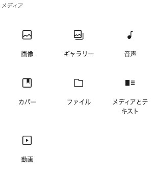
- 画像
- ギャラリー
- 音声
- カバー
- ファイル
- メディアとテキスト
- 動画
今回試した内容のコードと表示は、下記で確認できます。
メディアカテゴリのデモページ
画像
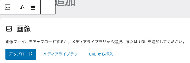
画像を挿入するためのブロックで、figureとimgタグで出力されます。
画像を選択すると以下のような表示になり、「アップロード」「メディアライブラリから選択」「URLから挿入」のいずれかで画像を追加します。
<figure class="wp-block-image size-large">
<img fetchpriority="high" decoding="async" width="1024" height="683" src="/xxxxx/test01-1024x683.jpg" alt="" class="wp-image-60" srcset="/xxxxx/test01-1024x683.jpg 1024w, /xxxxx/test01-300x200.jpg 300w, /xxxxx/test01-768x512.jpg 768w, /xxxxx/test01-1536x1024.jpg 1536w, /xxxxx/test01.jpg 1600w" sizes="(max-width: 1024px) 100vw, 1024px" />
</figure>
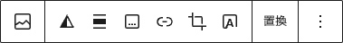
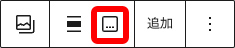
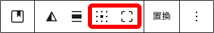
ブロックツールバーの内容は以下になります。
以下のボタンはデュオトーンフィルターの設定で、色を指定して画像にフィルタの設定ができます。
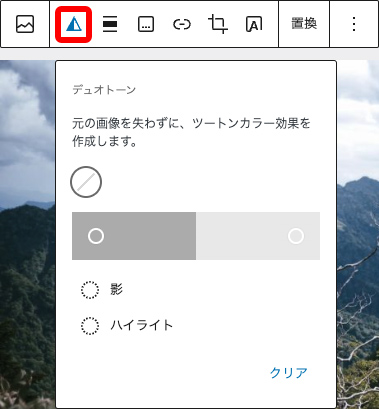
影を#000000、ハイライトを#CCCCCC に変更して設定してみます。
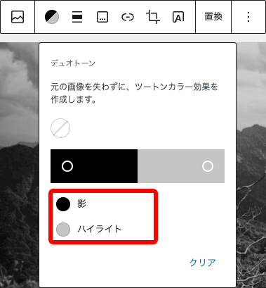
フィルタはSVGを使って適用されます。
<figure class="wp-block-image size-large wp-duotone-rgb000-rgb204204204-1">
<img fetchpriority="high" decoding="async" width="1024" height="683" src="/xxxxx/test01-1024x683.jpg" alt="" class="wp-image-60" srcset="/xxxxx/test01-1024x683.jpg 1024w, /xxxxx/test01-300x200.jpg 300w, /xxxxx/test01-768x512.jpg 768w, /xxxxx/test01-1536x1024.jpg 1536w, /xxxxx/test01.jpg 1600w" sizes="(max-width: 1024px) 100vw, 1024px" />
</figure>

<svg xmlns="http://www.w3.org/2000/svg" viewBox="0 0 0 0" width="0" height="0" focusable="false" role="none" style="visibility: hidden; position: absolute; left: -9999px; overflow: hidden;" ><defs><filter id="wp-duotone-rgb000-rgb204204204-1"><feColorMatrix color-interpolation-filters="sRGB" type="matrix" values=" .299 .587 .114 0 0 .299 .587 .114 0 0 .299 .587 .114 0 0 .299 .587 .114 0 0 " /><feComponentTransfer color-interpolation-filters="sRGB" ><feFuncR type="table" tableValues="0 0.8" /><feFuncG type="table" tableValues="0 0.8" /><feFuncB type="table" tableValues="0 0.8" /><feFuncA type="table" tableValues="1 1" /></feComponentTransfer><feComposite in2="SourceGraphic" operator="in" /></filter></defs></svg>
<style id='core-block-supports-duotone-inline-css' type='text/css'>
.wp-duotone-rgb000-rgb204204204-1.wp-block-image img, .wp-duotone-rgb000-rgb204204204-1.wp-block-image .components-placeholder{filter:url(#wp-duotone-rgb000-rgb204204204-1);}
</style>
以下のボタンは配置の設定です。
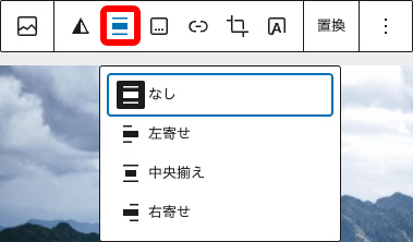
<div class="wp-block-image">
<figure class="alignleft size-large">
<img fetchpriority="high" decoding="async" width="1024" height="683" src="/xxxxx/test01-1024x683.jpg" alt="" class="wp-image-60" srcset="/xxxxx/test01-1024x683.jpg 1024w, /xxxxx/test01-300x200.jpg 300w, /xxxxx/test01-768x512.jpg 768w, /xxxxx/test01-1536x1024.jpg 1536w, /xxxxx/test01.jpg 1600w" sizes="(max-width: 1024px) 100vw, 1024px" />
</figure>
</div>

<div class="wp-block-image">
<figure class="aligncenter size-large">
<img fetchpriority="high" decoding="async" width="1024" height="683" src="/xxxxx/test01-1024x683.jpg" alt="" class="wp-image-60" srcset="/xxxxx/test01-1024x683.jpg 1024w, /xxxxx/test01-300x200.jpg 300w, /xxxxx/test01-768x512.jpg 768w, /xxxxx/test01-1536x1024.jpg 1536w, /xxxxx/test01.jpg 1600w" sizes="(max-width: 1024px) 100vw, 1024px" />
</figure>
</div>

<div class="wp-block-image">
<figure class="alignright size-large">
<img fetchpriority="high" decoding="async" width="1024" height="683" src="/xxxxx/test01-1024x683.jpg" alt="" class="wp-image-60" srcset="/xxxxx/test01-1024x683.jpg 1024w, /xxxxx/test01-300x200.jpg 300w, /xxxxx/test01-768x512.jpg 768w, /xxxxx/test01-1536x1024.jpg 1536w, /xxxxx/test01.jpg 1600w" sizes="(max-width: 1024px) 100vw, 1024px" />
</figure>
</div>
以下のボタンはキャプションの追加で、選択すると画像下部にキャプションのテキストを追加できます。
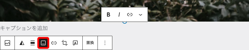
<figure class="wp-block-image size-large">
<img fetchpriority="high" decoding="async" width="1024" height="683" src="/xxxxx/test01-1024x683.jpg" alt="" class="wp-image-60" srcset="/xxxxx/test01-1024x683.jpg 1024w, /xxxxx/test01-300x200.jpg 300w, /xxxxx/test01-768x512.jpg 768w, /xxxxx/test01-1536x1024.jpg 1536w, /xxxxx/test01.jpg 1600w" sizes="(max-width: 1024px) 100vw, 1024px" />
<figcaption class="wp-element-caption">キャプションテキスト</figcaption>
</figure>
以下のボタンはリンクの挿入で、「URLの指定」「メディアファイル」「添付ファイルのページ」から選択できます。
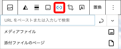
<figure class="wp-block-image size-large">
<a href="https://www.google.co.jp/">
<img fetchpriority="high" decoding="async" width="1024" height="683" src="/xxxxx/test01-1024x683.jpg" alt="" class="wp-image-60" srcset="/xxxxx/test01-1024x683.jpg 1024w, /xxxxx/test01-300x200.jpg 300w, /xxxxx/test01-768x512.jpg 768w, /xxxxx/test01-1536x1024.jpg 1536w, /xxxxx/test01.jpg 1600w" sizes="(max-width: 1024px) 100vw, 1024px" />
</a>
</figure>

<figure class="wp-block-image size-large">
<a href="/xxxxx/test01.jpg">
<img fetchpriority="high" decoding="async" width="1024" height="683" src="/xxxxx/test01-1024x683.jpg" alt="" class="wp-image-60" srcset="/xxxxx/test01-1024x683.jpg 1024w, /xxxxx/test01-300x200.jpg 300w, /xxxxx/test01-768x512.jpg 768w, /xxxxx/test01-1536x1024.jpg 1536w, /xxxxx/test01.jpg 1600w" sizes="(max-width: 1024px) 100vw, 1024px" />
</a>
</figure>

<figure class="wp-block-image size-large">
<a href="/?attachment_id=xxx">
<img fetchpriority="high" decoding="async" width="1024" height="683" src="/xxxxx/test01-1024x683.jpg" alt="" class="wp-image-60" srcset="/xxxxx/test01-1024x683.jpg 1024w, /xxxxx/test01-300x200.jpg 300w, /xxxxx/test01-768x512.jpg 768w, /xxxxx/test01-1536x1024.jpg 1536w, /xxxxx/test01.jpg 1600w" sizes="(max-width: 1024px) 100vw, 1024px" />
</a>
</figure>
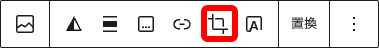
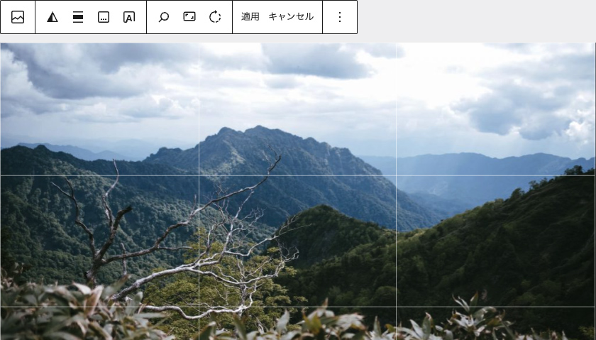
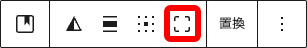
以下のボタン画像の切り抜きで、選択すると画面上で画像の編集ができます。
以下が編集中の表示です。
<figure class="wp-block-image size-large">
<img decoding="async" width="800" height="534" src="/xxxxx/test01-edited.jpg" alt="" class="wp-image-130" srcset="/xxxxx/test01-edited.jpg 800w, /xxxxx/test01-edited-300x200.jpg 300w, /xxxxx/test01-edited-768x513.jpg 768w" sizes="(max-width: 800px) 100vw, 800px" />
</figure>
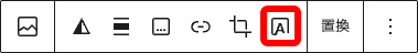
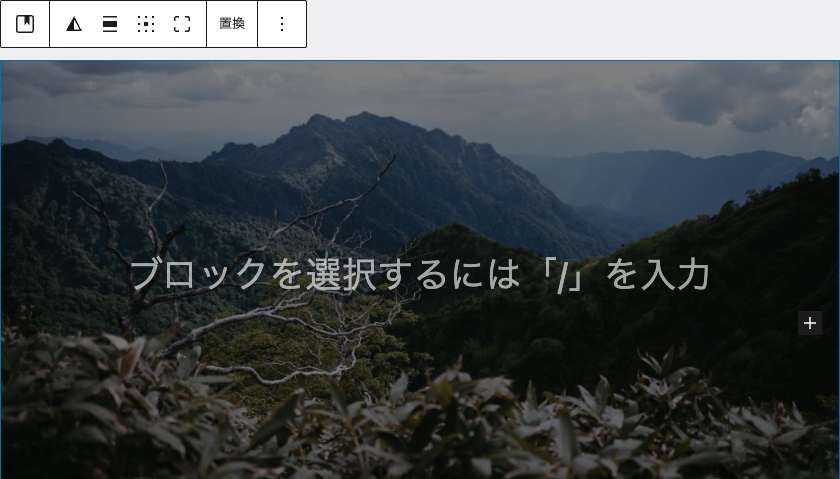
以下のボタンは画像上へのテキストの追加です。
追加すると以下のような表示になります。
デフォルトは段落ですが、それ以外のブロックを選択することもできます。
<div class="wp-block-cover">
<span aria-hidden="true" class="wp-block-cover__background has-background-dim"></span>
<img decoding="async" width="1024" height="683" class="wp-block-cover__image-background wp-image-60" alt="" src="/xxxxx/test01-1024x683.jpg" data-object-fit="cover" srcset="/xxxxx/test01-1024x683.jpg 1024w, /xxxxx/test01-300x200.jpg 300w, /xxxxx/test01-768x512.jpg 768w, /xxxxx/test01-1536x1024.jpg 1536w, /xxxxx/test01.jpg 1600w" sizes="(max-width: 1024px) 100vw, 1024px" />
<div class="wp-block-cover__inner-container is-layout-flow wp-block-cover-is-layout-flow">
<p class="has-text-align-center has-large-font-size">画像上にテキスト追加</p>
</div>
</div>

<div class="wp-block-cover">
<span aria-hidden="true" class="wp-block-cover__background has-background-dim"></span>
<img decoding="async" width="1024" height="683" class="wp-block-cover__image-background wp-image-60" alt="" src="/xxxxx/test01-1024x683.jpg" data-object-fit="cover" srcset="/xxxxx/test01-1024x683.jpg 1024w, /xxxxx/test01-300x200.jpg 300w, /xxxxx/test01-768x512.jpg 768w, /xxxxx/test01-1536x1024.jpg 1536w, /xxxxx/test01.jpg 1600w" sizes="(max-width: 1024px) 100vw, 1024px" />
<div class="wp-block-cover__inner-container is-layout-flow wp-block-cover-is-layout-flow">
<h2 class="wp-block-heading">見出し</h2>
</div>
</div>
画像上へのテキストの追加の際はブロックツールバーの内容が変わり、コンテンツの位置変更とフルハイトの切り替えができます。
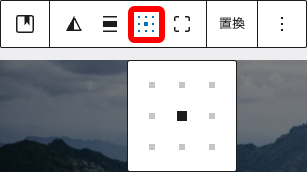
コンテンツの位置変更は下記ボタンで、上下左右斜めと中央の9種類から選択できます。
<div class="wp-block-cover has-custom-content-position is-position-top-left">
<span aria-hidden="true" class="wp-block-cover__background has-background-dim"></span>
<img decoding="async" width="1024" height="683" class="wp-block-cover__image-background wp-image-60" alt="" src="/xxxxx/test01-1024x683.jpg" data-object-fit="cover" srcset="/xxxxx/test01-1024x683.jpg 1024w, /xxxxx/test01-300x200.jpg 300w, /xxxxx/test01-768x512.jpg 768w, /xxxxx/test01-1536x1024.jpg 1536w, /xxxxx/test01.jpg 1600w" sizes="(max-width: 1024px) 100vw, 1024px" />
<div class="wp-block-cover__inner-container is-layout-flow wp-block-cover-is-layout-flow">
<p class="has-text-align-center has-large-font-size">左上</p>
</div>
</div>

<div class="wp-block-cover has-custom-content-position is-position-bottom-right">
<span aria-hidden="true" class="wp-block-cover__background has-background-dim"></span>
<img decoding="async" width="1024" height="683" class="wp-block-cover__image-background wp-image-60" alt="" src="/xxxxx/test01-1024x683.jpg" data-object-fit="cover" srcset="/xxxxx/test01-1024x683.jpg 1024w, /xxxxx/test01-300x200.jpg 300w, /xxxxx/test01-768x512.jpg 768w, /xxxxx/test01-1536x1024.jpg 1536w, /xxxxx/test01.jpg 1600w" sizes="(max-width: 1024px) 100vw, 1024px" />
<div class="wp-block-cover__inner-container is-layout-flow wp-block-cover-is-layout-flow">
<p class="has-text-align-center has-large-font-size">右下</p>
</div>
</div>
フルハイトの切り替えは以下のボタンで、画像を画面高さいっぱいまで広げて表示するようになります。
<div class="wp-block-cover" style="min-height:100vh">
<span aria-hidden="true" class="wp-block-cover__background has-background-dim"></span>
<img decoding="async" width="1024" height="683" class="wp-block-cover__image-background wp-image-60" alt="" src="/xxxxx/test01-1024x683.jpg" data-object-fit="cover" srcset="/xxxxx/test01-1024x683.jpg 1024w, /xxxxx/test01-300x200.jpg 300w, /xxxxx/test01-768x512.jpg 768w, /xxxxx/test01-1536x1024.jpg 1536w, /xxxxx/test01.jpg 1600w" sizes="(max-width: 1024px) 100vw, 1024px" />
<div class="wp-block-cover__inner-container is-layout-flow wp-block-cover-is-layout-flow">
<p class="has-text-align-center has-large-font-size">フルハイトの切り替え</p>
</div>
</div>
設定サイドバーで設定できる内容は以下の通りです。
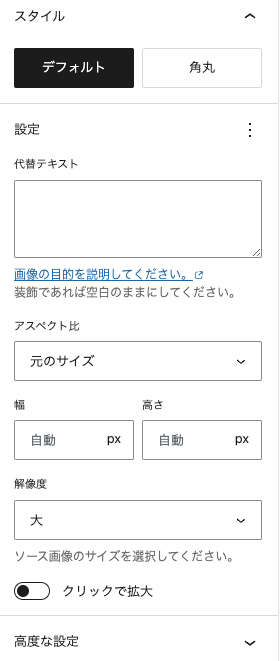
角丸とクリックで拡大を試してみます。
まずは角丸です。
<figure class="wp-block-image size-large is-style-rounded">
<img fetchpriority="high" decoding="async" width="1024" height="683" src="/xxxxx/test01-1024x683.jpg" alt="" class="wp-image-60" srcset="/xxxxx/test01-1024x683.jpg 1024w, /xxxxx/test01-300x200.jpg 300w, /xxxxx/test01-768x512.jpg 768w, /xxxxx/test01-1536x1024.jpg 1536w, /xxxxx/test01.jpg 1600w" sizes="(max-width: 1024px) 100vw, 1024px" />
</figure>
次にクリックで拡大です。
<figure data-wp-context="{ "core":
{ "image":
{ "imageLoaded": false,
"initialized": false,
"lightboxEnabled": false,
"hideAnimationEnabled": false,
"preloadInitialized": false,
"lightboxAnimation": "zoom",
"imageUploadedSrc": "/xxxxx/test01.jpg",
"imageCurrentSrc": "",
"targetWidth": "1600",
"targetHeight": "1067",
"scaleAttr": "",
"dialogLabel": "拡大された画像"
}
}
}" data-wp-interactive class="wp-block-image size-large wp-lightbox-container">
<img loading="lazy" decoding="async" width="1024" height="683" data-wp-effect--setStylesOnResize="effects.core.image.setStylesOnResize" data-wp-effect="effects.core.image.setButtonStyles" data-wp-init="effects.core.image.initOriginImage" data-wp-on--click="actions.core.image.showLightbox" data-wp-on--load="actions.core.image.handleLoad" src="/xxxxx/test01-1024x683.jpg" alt="" class="wp-image-60" srcset="/xxxxx/test01-1024x683.jpg 1024w, /xxxxx/test01-300x200.jpg 300w, /xxxxx/test01-768x512.jpg 768w, /xxxxx/test01-1536x1024.jpg 1536w, /xxxxx/test01.jpg 1600w" sizes="(max-width: 1024px) 100vw, 1024px" />
<button
class="lightbox-trigger"
type="button"
aria-haspopup="dialog"
aria-label="画像を拡大"
data-wp-on--click="actions.core.image.showLightbox"
data-wp-style--right="context.core.image.imageButtonRight"
data-wp-style--top="context.core.image.imageButtonTop"
>
<svg xmlns="http://www.w3.org/2000/svg" width="12" height="12" fill="none" viewBox="0 0 12 12">
<path fill="#fff" d="M2 0a2 2 0 0 0-2 2v2h1.5V2a.5.5 0 0 1 .5-.5h2V0H2Zm2 10.5H2a.5.5 0 0 1-.5-.5V8H0v2a2 2 0 0 0 2 2h2v-1.5ZM8 12v-1.5h2a.5.5 0 0 0 .5-.5V8H12v2a2 2 0 0 1-2 2H8Zm2-12a2 2 0 0 1 2 2v2h-1.5V2a.5.5 0 0 0-.5-.5H8V0h2Z" />
</svg>
</button>
<div data-wp-body="" class="wp-lightbox-overlay zoom"
data-wp-bind--role="selectors.core.image.roleAttribute"
data-wp-bind--aria-label="selectors.core.image.dialogLabel"
data-wp-class--initialized="context.core.image.initialized"
data-wp-class--active="context.core.image.lightboxEnabled"
data-wp-class--hideAnimationEnabled="context.core.image.hideAnimationEnabled"
data-wp-bind--aria-modal="selectors.core.image.ariaModal"
data-wp-effect="effects.core.image.initLightbox"
data-wp-on--keydown="actions.core.image.handleKeydown"
data-wp-on--touchstart="actions.core.image.handleTouchStart"
data-wp-on--touchmove="actions.core.image.handleTouchMove"
data-wp-on--touchend="actions.core.image.handleTouchEnd"
data-wp-on--click="actions.core.image.hideLightbox"
tabindex="-1"
>
<button type="button" aria-label="閉じる" style="fill: #000" class="close-button" data-wp-on--click="actions.core.image.hideLightbox">
<svg xmlns="http://www.w3.org/2000/svg" viewBox="0 0 24 24" width="20" height="20" aria-hidden="true" focusable="false"><path d="M13 11.8l6.1-6.3-1-1-6.1 6.2-6.1-6.2-1 1 6.1 6.3-6.5 6.7 1 1 6.5-6.6 6.5 6.6 1-1z"></path></svg>
</button>
<div class="lightbox-image-container">
<figure class="wp-block-image size-large responsive-image"><img decoding="async" data-wp-bind--src="context.core.image.imageCurrentSrc" data-wp-style--object-fit="selectors.core.image.lightboxObjectFit" src="" alt="" class="wp-image-60"/></figure>
</div>
<div class="lightbox-image-container">
<figure class="wp-block-image size-large enlarged-image"><img decoding="async" data-wp-bind--src="selectors.core.image.enlargedImgSrc" data-wp-style--object-fit="selectors.core.image.lightboxObjectFit" src="" alt="" class="wp-image-60"/></figure>
</div>
<div class="scrim" style="background-color: #fff" aria-hidden="true"></div>
</div>
</figure>
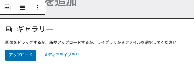
ギャラリー
ギャラリーは複数の画像を表示する際に使用するブロックで、figureとimgタグで出力されます。
画像を選択すると以下のような表示になり、「アップロード」「メディアライブラリ」のどちらかで画像を追加します。
<figure class="wp-block-gallery has-nested-images columns-default is-cropped wp-block-gallery-2 is-layout-flex wp-block-gallery-is-layout-flex">
<figure class="wp-block-image size-large">
<img loading="lazy" decoding="async" width="1024" height="683" data-id="62" src="/xxxxx/test02-1024x683.jpg" alt="" class="wp-image-62" srcset="/xxxxx/test02-1024x683.jpg 1024w, /xxxxx/test02-300x200.jpg 300w, /xxxxx/test02-768x512.jpg 768w, /xxxxx/test02-1536x1024.jpg 1536w, /xxxxx/test02.jpg 1600w" sizes="(max-width: 1024px) 100vw, 1024px" />
</figure>
<figure class="wp-block-image size-large">
<img loading="lazy" decoding="async" width="1024" height="682" data-id="63" src="/xxxxx/test03-1024x682.jpg" alt="" class="wp-image-63" srcset="/xxxxx/test03-1024x682.jpg 1024w, /xxxxx/test03-300x200.jpg 300w, /xxxxx/test03-768x512.jpg 768w, /xxxxx/test03-1536x1023.jpg 1536w, /xxxxx/test03.jpg 1600w" sizes="(max-width: 1024px) 100vw, 1024px" />
</figure>
</figure>

<figure class="wp-block-gallery has-nested-images columns-default is-cropped wp-block-gallery-3 is-layout-flex wp-block-gallery-is-layout-flex">
<figure class="wp-block-image size-large">
<img loading="lazy" decoding="async" width="1024" height="683" data-id="62" src="/xxxxx/test02-1024x683.jpg" alt="" class="wp-image-62" srcset="/xxxxx/test02-1024x683.jpg 1024w, /xxxxx/test02-300x200.jpg 300w, /xxxxx/test02-768x512.jpg 768w, /xxxxx/test02-1536x1024.jpg 1536w, /xxxxx/test02.jpg 1600w" sizes="(max-width: 1024px) 100vw, 1024px" />
</figure>
<figure class="wp-block-image size-large">
<img loading="lazy" decoding="async" width="1024" height="682" data-id="63" src="/xxxxx/test03-1024x682.jpg" alt="" class="wp-image-63" srcset="/xxxxx/test03-1024x682.jpg 1024w, /xxxxx/test03-300x200.jpg 300w, /xxxxx/test03-768x512.jpg 768w, /xxxxx/test03-1536x1023.jpg 1536w, /xxxxx/test03.jpg 1600w" sizes="(max-width: 1024px) 100vw, 1024px" />
</figure>
<figure class="wp-block-image size-large">
<img loading="lazy" decoding="async" width="1024" height="682" data-id="64" src="/xxxxx/test04-1024x682.jpg" alt="" class="wp-image-64" srcset="/xxxxx/test04-1024x682.jpg 1024w, /xxxxx/test04-300x200.jpg 300w, /xxxxx/test04-768x512.jpg 768w, /xxxxx/test04-1536x1023.jpg 1536w, /xxxxx/test04.jpg 1600w" sizes="(max-width: 1024px) 100vw, 1024px" />
</figure>
</figure>

<figure class="wp-block-gallery has-nested-images columns-default is-cropped wp-block-gallery-4 is-layout-flex wp-block-gallery-is-layout-flex">
<figure class="wp-block-image size-large">
<img loading="lazy" decoding="async" width="1024" height="683" data-id="62" src="/xxxxx/test02-1024x683.jpg" alt="" class="wp-image-62" srcset="/xxxxx/test02-1024x683.jpg 1024w, /xxxxx/test02-300x200.jpg 300w, /xxxxx/test02-768x512.jpg 768w, /xxxxx/test02-1536x1024.jpg 1536w, /xxxxx/test02.jpg 1600w" sizes="(max-width: 1024px) 100vw, 1024px" />
</figure>
<figure class="wp-block-image size-large">
<img loading="lazy" decoding="async" width="1024" height="682" data-id="63" src="/xxxxx/test03-1024x682.jpg" alt="" class="wp-image-63" srcset="/xxxxx/test03-1024x682.jpg 1024w, /xxxxx/test03-300x200.jpg 300w, /xxxxx/test03-768x512.jpg 768w, /xxxxx/test03-1536x1023.jpg 1536w, /xxxxx/test03.jpg 1600w" sizes="(max-width: 1024px) 100vw, 1024px" />
</figure>
<figure class="wp-block-image size-large">
<img loading="lazy" decoding="async" width="1024" height="682" data-id="64" src="/xxxxx/test04-1024x682.jpg" alt="" class="wp-image-64" srcset="/xxxxx/test04-1024x682.jpg 1024w, /xxxxx/test04-300x200.jpg 300w, /xxxxx/test04-768x512.jpg 768w, /xxxxx/test04-1536x1023.jpg 1536w, /xxxxx/test04.jpg 1600w" sizes="(max-width: 1024px) 100vw, 1024px" />
</figure>
<figure class="wp-block-image size-large">
<img loading="lazy" decoding="async" width="1024" height="682" data-id="65" src="/xxxxx/test05-1024x682.jpg" alt="" class="wp-image-65" srcset="/xxxxx/test05-1024x682.jpg 1024w, /xxxxx/test05-300x200.jpg 300w, /xxxxx/test05-768x512.jpg 768w, /xxxxx/test05-1536x1023.jpg 1536w, /xxxxx/test05.jpg 1600w" sizes="(max-width: 1024px) 100vw, 1024px" />
</figure>
</figure>

<figure class="wp-block-gallery has-nested-images columns-default is-cropped wp-block-gallery-5 is-layout-flex wp-block-gallery-is-layout-flex">
<figure class="wp-block-image size-large">
<img loading="lazy" decoding="async" width="1024" height="683" data-id="62" src="/xxxxx/test02-1024x683.jpg" alt="" class="wp-image-62" srcset="/xxxxx/test02-1024x683.jpg 1024w, /xxxxx/test02-300x200.jpg 300w, /xxxxx/test02-768x512.jpg 768w, /xxxxx/test02-1536x1024.jpg 1536w, /xxxxx/test02.jpg 1600w" sizes="(max-width: 1024px) 100vw, 1024px" />
</figure>
<figure class="wp-block-image size-large">
<img loading="lazy" decoding="async" width="1024" height="682" data-id="63" src="/xxxxx/test03-1024x682.jpg" alt="" class="wp-image-63" srcset="/xxxxx/test03-1024x682.jpg 1024w, /xxxxx/test03-300x200.jpg 300w, /xxxxx/test03-768x512.jpg 768w, /xxxxx/test03-1536x1023.jpg 1536w, /xxxxx/test03.jpg 1600w" sizes="(max-width: 1024px) 100vw, 1024px" />
</figure>
<figure class="wp-block-image size-large">
<img loading="lazy" decoding="async" width="1024" height="682" data-id="64" src="/xxxxx/test04-1024x682.jpg" alt="" class="wp-image-64" srcset="/xxxxx/test04-1024x682.jpg 1024w, /xxxxx/test04-300x200.jpg 300w, /xxxxx/test04-768x512.jpg 768w, /xxxxx/test04-1536x1023.jpg 1536w, /xxxxx/test04.jpg 1600w" sizes="(max-width: 1024px) 100vw, 1024px" />
</figure>
<figure class="wp-block-image size-large">
<img loading="lazy" decoding="async" width="1024" height="682" data-id="65" src="/xxxxx/test05-1024x682.jpg" alt="" class="wp-image-65" srcset="/xxxxx/test05-1024x682.jpg 1024w, /xxxxx/test05-300x200.jpg 300w, /xxxxx/test05-768x512.jpg 768w, /xxxxx/test05-1536x1023.jpg 1536w, /xxxxx/test05.jpg 1600w" sizes="(max-width: 1024px) 100vw, 1024px" />
</figure>
<figure class="wp-block-image size-large">
<img loading="lazy" decoding="async" width="1024" height="683" data-id="66" src="/xxxxx/test06-1024x683.jpg" alt="" class="wp-image-66" srcset="/xxxxx/test06-1024x683.jpg 1024w, /xxxxx/test06-300x200.jpg 300w, /xxxxx/test06-768x512.jpg 768w, /xxxxx/test06-1536x1024.jpg 1536w, /xxxxx/test06.jpg 1600w" sizes="(max-width: 1024px) 100vw, 1024px" />
</figure>
</figure>
ギャラリーで表示されるブロックツールバーは以下の通りで、ギャラリー全体へのキャプションの設定ができます。
<figure class="wp-block-gallery has-nested-images columns-default is-cropped wp-block-gallery-6 is-layout-flex wp-block-gallery-is-layout-flex">
<figure class="wp-block-image size-large">
<img loading="lazy" decoding="async" width="1024" height="683" data-id="62" src="/xxxxx/test02-1024x683.jpg" alt="" class="wp-image-62" srcset="/xxxxx/test02-1024x683.jpg 1024w, /xxxxx/test02-300x200.jpg 300w, /xxxxx/test02-768x512.jpg 768w, /xxxxx/test02-1536x1024.jpg 1536w, /xxxxx/test02.jpg 1600w" sizes="(max-width: 1024px) 100vw, 1024px" />
</figure>
<figure class="wp-block-image size-large">
<img loading="lazy" decoding="async" width="1024" height="682" data-id="63" src="/xxxxx/test03-1024x682.jpg" alt="" class="wp-image-63" srcset="/xxxxx/test03-1024x682.jpg 1024w, /xxxxx/test03-300x200.jpg 300w, /xxxxx/test03-768x512.jpg 768w, /xxxxx/test03-1536x1023.jpg 1536w, /xxxxx/test03.jpg 1600w" sizes="(max-width: 1024px) 100vw, 1024px" />
</figure>
<figcaption class="blocks-gallery-caption wp-element-caption">ギャラリー全体へのキャプション</figcaption>
</figure>
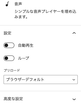
音声
音声ファイルを埋め込むブロックで、figureとaudioタグで出力されます。
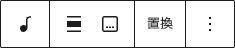
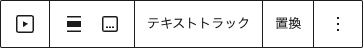
ブロックツールバーの表示は以下の通りです。
<figure class="wp-block-audio">
<audio controls src="/xxxxx/audio.mp3"></audio>
</figure>
設定サイドバーは以下の通りで、自動再生やループ、プリロードの設定ができます。
<figure class="wp-block-audio">
<audio controls src="/xxxxx/audio.mp3" autoplay loop preload="metadata"></audio>
</figure>
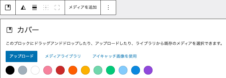
カバー
テキストオーバーレイ付きの画像や動画を追加するブロックです。
カバーを選択すると以下のような表示になり、「アップロード」「メディアライブラリ」「アイキャッチ画像を使用」で画像を選択するか、その下の色のパレットから背景色を選択します。
<div class="wp-block-cover">
<span aria-hidden="true" class="wp-block-cover__background has-background-dim"></span>
<img loading="lazy" decoding="async" width="1600" height="1066" class="wp-block-cover__image-background wp-image-68" alt="" src="/xxxxx/test07.jpg" data-object-fit="cover" srcset="/xxxxx/test07.jpg 1600w, /xxxxx/test07-300x200.jpg 300w, /xxxxx/test07-1024x682.jpg 1024w, /xxxxx/test07-768x512.jpg 768w, /xxxxx/test07-1536x1023.jpg 1536w" sizes="(max-width: 1600px) 100vw, 1600px" />
<div class="wp-block-cover__inner-container is-layout-constrained wp-block-cover-is-layout-constrained">
<p class="has-text-align-center has-large-font-size">カバーテキスト</p>
</div>
</div>

<div class="wp-block-cover is-light">
<span aria-hidden="true" class="wp-block-cover__background has-light-green-cyan-background-color has-background-dim-100 has-background-dim"></span>
<div class="wp-block-cover__inner-container is-layout-constrained wp-block-cover-is-layout-constrained">
<p class="has-text-align-center has-large-font-size">カバーテキスト</p>
</div>
</div>
ブロックツールバーは以下の通りで、画像ブロックの画像上へのテキスト追加と同じく、コンテンツの位置変更やフルハイトの切り替えが行えます。
<div class="wp-block-cover has-custom-content-position is-position-top-center">
<span aria-hidden="true" class="wp-block-cover__background has-background-dim"></span>
<img loading="lazy" decoding="async" width="1600" height="1066" class="wp-block-cover__image-background wp-image-68" alt="" src="/xxxxx/test07.jpg" data-object-fit="cover" srcset="/xxxxx/test07.jpg 1600w, /xxxxx/test07-300x200.jpg 300w, /xxxxx/test07-1024x682.jpg 1024w, /xxxxx/test07-768x512.jpg 768w, /xxxxx/test07-1536x1023.jpg 1536w" sizes="(max-width: 1600px) 100vw, 1600px" />
<div class="wp-block-cover__inner-container is-layout-constrained wp-block-cover-is-layout-constrained">
<p class="has-text-align-center has-large-font-size">上部配置</p>
</div>
</div>

<div class="wp-block-cover has-custom-content-position is-position-center-right" style="min-height:100vh">
<span aria-hidden="true" class="wp-block-cover__background has-background-dim"></span>
<img loading="lazy" decoding="async" width="1600" height="1066" class="wp-block-cover__image-background wp-image-68" alt="" src="/xxxxx/test07.jpg" data-object-fit="cover" srcset="/xxxxx/test07.jpg 1600w, /xxxxx/test07-300x200.jpg 300w, /xxxxx/test07-1024x682.jpg 1024w, /xxxxx/test07-768x512.jpg 768w, /xxxxx/test07-1536x1023.jpg 1536w" sizes="(max-width: 1600px) 100vw, 1600px" />
<div class="wp-block-cover__inner-container is-layout-constrained wp-block-cover-is-layout-constrained">
<p class="has-text-align-center has-large-font-size">右配置 + フルハイト</p>
</div>
</div>

<div class="wp-block-cover has-custom-content-position is-position-center-right" style="min-height:100vh">
<span aria-hidden="true" class="wp-block-cover__background has-vivid-red-background-color has-background-dim-100 has-background-dim"></span>
<div class="wp-block-cover__inner-container is-layout-constrained wp-block-cover-is-layout-constrained">
<p class="has-text-align-center has-large-font-size">右配置 + フルハイト</p>
</div>
</div>
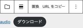
ファイル
ファイルをダウンロードするリンクを追加するブロックです。
画像ファイルや音声ファイル、動画ファイルの場合、ダウンロードボタンが表示されます。
<div class="wp-block-file">
<a id="wp-block-file--media-066ab657-072a-405c-aca1-bc27de1956ef" href="/xxxxx/test08.jpg">test08</a>
<a href="/xxxxx/test08.jpg" class="wp-block-file__button wp-element-button" download aria-describedby="wp-block-file--media-066ab657-072a-405c-aca1-bc27de1956ef">ダウンロード</a>
</div>

<div class="wp-block-file">
<a id="wp-block-file--media-6979e0dc-12ac-4899-b93c-a44d848f06b8" href="/xxxxx/audio.mp3">audio</a>
<a href="/xxxxx/audio.mp3" class="wp-block-file__button wp-element-button" download aria-describedby="wp-block-file--media-6979e0dc-12ac-4899-b93c-a44d848f06b8">ダウンロード</a>
</div>

<div class="wp-block-file">
<a id="wp-block-file--media-145af025-79ab-44f6-8500-0d21a65b6781" href="/xxxxx/movie.mp4">movie</a>
<a href="/xxxxx/movie.mp4" class="wp-block-file__button wp-element-button" download aria-describedby="wp-block-file--media-145af025-79ab-44f6-8500-0d21a65b6781">ダウンロード</a>
</div>
PDFファイルの場合、PDFファイルの埋め込みとダウンロードボタンが表示されます。
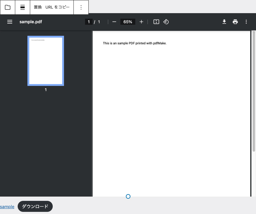
<div data-wp-interactive="" class="wp-block-file">
<object data-wp-bind--hidden="!selectors.core.file.hasPdfPreview" hidden class="wp-block-file__embed" data="/xxxxx/sample.pdf" type="application/pdf" style="width:100%;height:600px" aria-label="sampleの埋め込み。"></object>
<a id="wp-block-file--media-f2ebde79-a29b-49a6-bbd9-736c80d99fa9" href="/xxxxx/sample.pdf">sample</a>
<a href="/xxxxx/sample.pdf" class="wp-block-file__button wp-element-button" download aria-describedby="wp-block-file--media-f2ebde79-a29b-49a6-bbd9-736c80d99fa9">ダウンロード</a>
</div>
</div>
ファイル名やダウンロードのテキストは変更できます。
<div class="wp-block-file">
<a id="wp-block-file--media-9aae6109-f7dc-43c0-99ab-3fc2fa9f2336" href="/xxxxx/test08.jpg">ファイル名のテキスト変更</a>
<a href="/xxxxx/test08.jpg" class="wp-block-file__button wp-element-button" download aria-describedby="wp-block-file--media-9aae6109-f7dc-43c0-99ab-3fc2fa9f2336">ダウンロードのテキスト変更</a>
</div>
</div>
メディアとテキスト
画像と文章を横並びにするブロックです。
<div class="wp-block-media-text is-stacked-on-mobile">
<figure class="wp-block-media-text__media">
<img loading="lazy" decoding="async" width="1024" height="682" src="/xxxxx/test09-1024x682.jpg" alt="" class="wp-image-154 size-full" srcset="/xxxxx/test09-1024x682.jpg 1024w, /xxxxx/test09-300x200.jpg 300w, /xxxxx/test09-768x512.jpg 768w, /xxxxx/test09-1536x1023.jpg 1536w, /xxxxx/test09.jpg 1600w" sizes="(max-width: 1024px) 100vw, 1024px" />
</figure>
<div class="wp-block-media-text__content">
<p>テキスト</p>
</div>
</div>
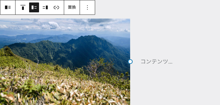
以下のボタンは垂直配置の変更で、上揃えと中央揃え、下揃に変更できます。
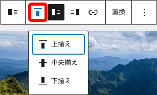
<div class="wp-block-media-text is-stacked-on-mobile is-vertically-aligned-top">
<figure class="wp-block-media-text__media">
<img loading="lazy" decoding="async" width="1024" height="682" src="/xxxxx/test09-1024x682.jpg" alt="" class="wp-image-154 size-full" srcset="/xxxxx/test09-1024x682.jpg 1024w, /xxxxx/test09-300x200.jpg 300w, /xxxxx/test09-768x512.jpg 768w, /xxxxx/test09-1536x1023.jpg 1536w, /xxxxx/test09.jpg 1600w" sizes="(max-width: 1024px) 100vw, 1024px" />
</figure>
<div class="wp-block-media-text__content">
<p>上揃え</p>
</div>
</div>

<div class="wp-block-media-text is-stacked-on-mobile is-vertically-aligned-center">
<figure class="wp-block-media-text__media">
<img loading="lazy" decoding="async" width="1024" height="682" src="/xxxxx/test09-1024x682.jpg" alt="" class="wp-image-154 size-full" srcset="/xxxxx/test09-1024x682.jpg 1024w, /xxxxx/test09-300x200.jpg 300w, /xxxxx/test09-768x512.jpg 768w, /xxxxx/test09-1536x1023.jpg 1536w, /xxxxx/test09.jpg 1600w" sizes="(max-width: 1024px) 100vw, 1024px" />
</figure>
<div class="wp-block-media-text__content">
<p>中央揃え</p>
</div>
</div>

<div class="wp-block-media-text is-stacked-on-mobile is-vertically-aligned-bottom">
<figure class="wp-block-media-text__media">
<img loading="lazy" decoding="async" width="1024" height="682" src="/xxxxx/test09-1024x682.jpg" alt="" class="wp-image-154 size-full" srcset="/xxxxx/test09-1024x682.jpg 1024w, /xxxxx/test09-300x200.jpg 300w, /xxxxx/test09-768x512.jpg 768w, /xxxxx/test09-1536x1023.jpg 1536w, /xxxxx/test09.jpg 1600w" sizes="(max-width: 1024px) 100vw, 1024px" />
</figure>
<div class="wp-block-media-text__content">
<p>下揃え</p>
</div>
</div>
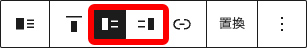
以下のボタンはメディア(画像)の位置を左にするか右にするかの設定で、デフォルトは左になっています。
<div class="wp-block-media-text has-media-on-the-right is-stacked-on-mobile">
<div class="wp-block-media-text__content">
<p>メディアを右に表示</p>
</div>
<figure class="wp-block-media-text__media">
<img loading="lazy" decoding="async" width="1024" height="682" src="/xxxxx/test09-1024x682.jpg" alt="" class="wp-image-154 size-full" srcset="/xxxxx/test09-1024x682.jpg 1024w, /xxxxx/test09-300x200.jpg 300w, /xxxxx/test09-768x512.jpg 768w, /xxxxx/test09-1536x1023.jpg 1536w, /xxxxx/test09.jpg 1600w" sizes="(max-width: 1024px) 100vw, 1024px" />
</figure>
</div>
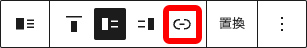
画像ブロックと同じようにリンクを貼ることもできますが、リンク対象はメディアとテキストのブロック全体ではなく、画像に対してのリンクになります。
<div class="wp-block-media-text is-stacked-on-mobile">
<figure class="wp-block-media-text__media">
<a href="https://www.google.co.jp/">
<img loading="lazy" decoding="async" width="1024" height="682" src="/xxxxx/test09-1024x682.jpg" alt="" class="wp-image-154 size-full" srcset="/xxxxx/test09-1024x682.jpg 1024w, /xxxxx/test09-300x200.jpg 300w, /xxxxx/test09-768x512.jpg 768w, /xxxxx/test09-1536x1023.jpg 1536w, /xxxxx/test09.jpg 1600w" sizes="(max-width: 1024px) 100vw, 1024px" />
</a>
</figure>
<div class="wp-block-media-text__content">
<p>リンク設定</p>
</div>
</div>
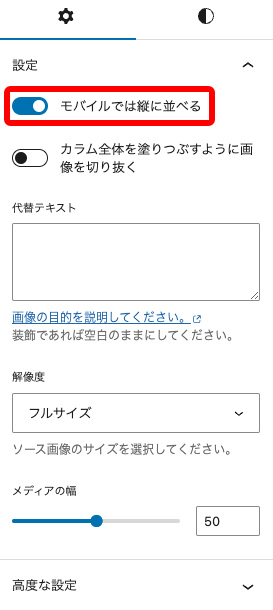
設定サイドバーは以下の通りです。
モバイルでメディアと画像を縦に並べるかどうかの設定ができます。(デフォルトは縦に並べる)
<div class="wp-block-media-text">
<figure class="wp-block-media-text__media">
<img loading="lazy" decoding="async" width="1024" height="682" src="/xxxxx/test09-1024x682.jpg" alt="" class="wp-image-154 size-full" srcset="/xxxxx/test09-1024x682.jpg 1024w, /xxxxx/test09-300x200.jpg 300w, /xxxxx/test09-768x512.jpg 768w, /xxxxx/test09-1536x1023.jpg 1536w, /xxxxx/test09.jpg 1600w" sizes="(max-width: 1024px) 100vw, 1024px" />
</figure>
<div class="wp-block-media-text__content">
<p>モバイルで縦に並べない</p>
</div>
</div>
メディアの幅を変更することで、画像とテキストの比率を変更することができます。
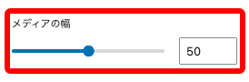
<div class="wp-block-media-text is-stacked-on-mobile" style="grid-template-columns:80% auto">
<figure class="wp-block-media-text__media">
<img loading="lazy" decoding="async" width="1024" height="682" src="/xxxxx/test09-1024x682.jpg" alt="" class="wp-image-154 size-full" srcset="/xxxxx/test09-1024x682.jpg 1024w, /xxxxx/test09-300x200.jpg 300w, /xxxxx/test09-768x512.jpg 768w, /xxxxx/test09-1536x1023.jpg 1536w, /xxxxx/test09.jpg 1600w" sizes="(max-width: 1024px) 100vw, 1024px" />
</figure>
<div class="wp-block-media-text__content">
<p>比率変更</p>
</div>
</div>
動画
動画ファイルを埋め込むブロックで、figureとvideoタグで出力されます。
<figure class="wp-block-video">
<video controls src="/xxxxx/movie.mp4"></video>
</figure>
設定サイドバーは以下の通りです。
自動再生・ループ・ミュート・インライン再生をオンに、コントロールをオフにして、プリロードを自動に変更してみます。
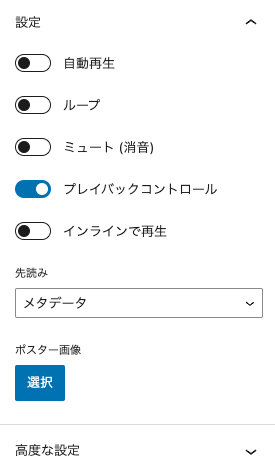
<figure class="wp-block-video">
<video autoplay loop muted preload="auto" src="/xxxxx/movie.mp4" playsinline></video>
</figure>
今回試した内容のコードと表示については、下記で確認ください。
メディアカテゴリのデモページ
コメントが承認されるまで時間がかかります。