CSS3のanimationと@keyframesを使ってでアニメーションを実装してみます。
対応ブラウザ
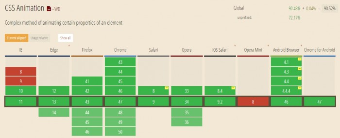
animationが対応しているブラウザはこちら。
IE10からの対応で、対応するブラウザによってはベンダープレフィックスが必要になります。
サンプルコード
animationでアニメーションの設定を行い、@keyframesで各フレームの状態を設定します。
HTML
<div id="sample"></div>
CSS
#sample {
	width: 200px;
	height: 200px;
	background: #E74C3C;
	-webkit-animation-name: sample;
	animation-name: sample;
	-webkit-animation-duration: 4s;
	animation-duration: 4s;
	-webkit-animation-delay: 2s;
	animation-delay: 2s;
	-webkit-animation-iteration-count: infinite;
	animation-iteration-count: infinite;
	-webkit-animation-direction: alternate;
	animation-direction: alternate;
	-webkit-animation-timing-function: linear;
	animation-timing-function: linear;
}

@-webkit-keyframes sample {
	0% {
		width: 200px;
		height: 200px;
	}
	50% {
		width: 400px;
		height: 200px;
	}
	100% {
		width: 400px;
		height: 400px;
	}
}

@keyframes sample {
	0% {
		width: 200px;
		height: 200px;
	}
	50% {
		width: 400px;
		height: 200px;
	}
	100% {
		width: 400px;
		height: 400px;
	}
}
アニメーション名を「sample」、アニメーションの時間を4秒、待ち時間を2秒、アニメーション回数をループ、アニメーション完了時に逆方向にアニメーションして繰り返し、アニメーションのイージングを「linear」に設定しました。
@keyframesに設定したアニメーション名(sample)を指定して、アニメーションの時間(4秒)内でどのフレーム時にどの状態になっているかを指定しています。
このサンプルの場合、2秒待機してからアニメーション開始して、2秒後にwidth 400px、4秒後にheight 400px、6秒後にheight 200px、8秒後にwidth 200pxで元に戻り、最初から繰り返すようになります。
animationと@keyframesのデモページ
| animation-name | @keyframesで使用する名前を指定。 初期値はnone。 |
|---|---|
| animation-duration | アニメーションする時間を指定。 単位はsで、初期値は0s。 |
| animation-delay | アニメーションの開始を遅らせる場合に指定。 単位はsで、初期値は0s。 |
| animation-iteration-count | アニメーションを繰り返す回数を指定。 初期値は1で、負の値は0として扱われる。 ループさせる場合はinfiniteを指定。 |
| animation-direction | アニメーションする方向を設定。 normal: 常に順方向にアニメーションする。初期値。 reverse: 常に逆方向にアニメーションする。 alternate: 順方向のアニメーション完了後、逆方向にアニメーションして初期状態に戻る。 alternate-reverse: 逆方向にアニメーションして初期状態に戻った後、順方向にアニメーションする。 |
| animation-timing-function | アニメーションのイージングを指定。 ease/ease-in/ease-out/ease-in-out/linear/cubic-bezier/step-start/step-stop/stepsからどれかを指定。 初期値はease。 |
@keyframesの開始と終了はfromとtoでも指定できます。
CSS
#sample {
	width: 200px;
	height: 200px;
	background: #E74C3C;
	-webkit-animation-name: sample;
	animation-name: sample;
	-webkit-animation-duration: 4s;
	animation-duration: 4s;
	-webkit-animation-delay: 2s;
	animation-delay: 2s;
	-webkit-animation-iteration-count: infinite;
	animation-iteration-count: infinite;
	-webkit-animation-direction: alternate;
	animation-direction: alternate;
	-webkit-animation-timing-function: linear;
	animation-timing-function: linear;
}

@-webkit-keyframes sample {
	from {
		width: 200px;
		height: 200px;
	}
	50% {
		width: 400px;
		height: 200px;
	}
	to {
		width: 400px;
		height: 400px;
	}
}

@keyframes sample {
	from {
		width: 200px;
		height: 200px;
	}
	50% {
		width: 400px;
		height: 200px;
	}
	to {
		width: 400px;
		height: 400px;
	}
}
animationをまとめて指定することもできます。
CSS
#sample {
	width: 200px;
	height: 200px;
	background: #E74C3C;
	-webkit-animation: sample 4s linear 2s infinite alternate;
	animation: sample 4s linear 2s infinite alternate;
}

@-webkit-keyframes sample {
	from {
		width: 200px;
		height: 200px;
	}
	50% {
		width: 400px;
		height: 200px;
	}
	to {
		width: 400px;
		height: 400px;
	}
}

@keyframes sample {
	from {
		width: 200px;
		height: 200px;
	}
	50% {
		width: 400px;
		height: 200px;
	}
	to {
		width: 400px;
		height: 400px;
	}
}
【参考サイト】
コメントが承認されるまで時間がかかります。